Blair Academy
Blair Academy is a dynamic, co-educational boarding school located in Blairstown New Jersey where students in grades 9-12 pursue a superior college preparatory education.
We were connected with Blair Academy through a mutual colleague. After a warm introduction to Suzy, their Assistant Head of School for Strategic Communications, we got on a quick call to discuss needs and see if we got along.
Blair was in need of graphic design on a variety of projects, everything from large fundraising booklets to post card sized student hand outs. We went to tour the beautiful campus, met with Suzy and her team, and the Head of School (and his dog!) and soon found that we would be a great fit for what they needed.

STAY CALM INDUSTRIES
Stay Calm Industries is a full service creative agency based in Allentown, PA, specializing in advertising, branding, copywriting, photography, videography, graphic design, social media, strategy and web design. While we’re typically crafting strategic design work for clients, this case study takes a more personal turn, we became our own client.
After a few years of building a portfolio of strong creative work, we realized our company’s branding no longer reflected the direction we were heading. It felt dated, casual, and wasn’t aligned with the more refined, elevated look we were aiming to deliver for others. So, we decided it was time to evolve, beginning with ourselves.
What started with a conversation about fonts, style, and strategy quickly grew into a full-scale internal rebrand, one rooted in intentionality, collaboration, and clean design.

Services
-
Branding
-
Graphic Design
-
Web Design
-
Photography
BRANDING
Our previous logo was built around a thick sans serif font, sometimes paired with a colorful plaid graphic. While it served us well for a time, it no longer reflected the quality or tone of work we were producing. We knew we wanted to shift toward something more timeless, elegant, and minimal, but still uniquely us.
We kicked off the rebrand with a discovery phase led by our lead designer. This included a lot of sketching, font research, and looking at brands we admire, particularly luxury watch companies, which our founder Evan has always appreciated for their classic appeal. We also pulled references from Evan’s bookmarked inspiration posts, Pinterest boards, and various design books around the studio.
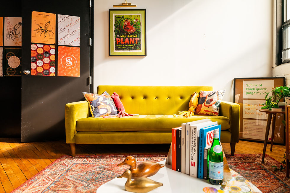
The key to the identity was our squid. We explored multiple hand-drawn versions to find the perfect balance of playfulness and sophistication. The final logo suite includes several custom squid marks and a refined serif wordmark. It’s clean, structured, and confident, just like we wanted.
After several rounds of review and a few strategic pivots (including scrapping an earlier script/sans serif direction), we landed on a system that truly felt like us.


RESULTS
Rebranding our own agency was a rewarding (and humbling) experience. This project was fully led by our Lead Graphic Designer Bri, while our Creative Director and Owner, Evan, was treated as the client. It gave our team the space to experiment, collaborate, and truly reflect on the type of agency we want to be. It also gave us the tools we needed to show up confidently in the creative space, both visually and strategically.
We’re proud of what we built together, and even more proud of how it reflects where we’re headed.
-Bri Figueroa, Lead Graphic Designer
"I wanted our branding to feel like it wouldn’t need to change again in a few years—something that speaks for us and the kind of clients we want to work with: elevated, clean, and confident."